BRING DATA TO LIFE
Turn information into visualizations anyone can understand.
Create interactive maps and charts that are fast and easy to design, customize, and contextualize with narratives.

Charts shouldn't take hours. Maps shouldn't need a specialist.
Visualizing data and making it easier to understand should be simple. And it shouldn't require intense training and degrees.
mySidewalk's platform is built so anyone can turn raw data into meaningful visualizations in just a few clicks. No technical training. No design software. No long wait.
Say hello to unmatched mapping & visualization tools that are easy to use
Customizable to Your Brand & Mission
Match your organization's look and feel with tools that let you tailor colors and layouts so your visuals stay on-brand and on-message.
Interactive Maps in Seconds
Skip the GIS tools. Just describe what you need and your built-in data assistant, Sidekick, helps you explore, explain, and visualize community data with a simple command.
Bivariate Maps & Normalization
Reveal complex relationships by mapping two variables at once, normalized for meaningful side-by-side comparisons across places.
Automatic Update Options
Keep your reports and dashboards fresh with full control over which charts and maps automatically update along with our data library.
Pre-Built Story Blocks & Templates
Save time and never start from a blank page with plug-and-play templates that will bring your data to life through interactive, polished visual components.
Tailored Narratives & Analyses
Add context and insight to every visualization with built-in narrative tools designed to help anyone explain the "why" behind the numbers.
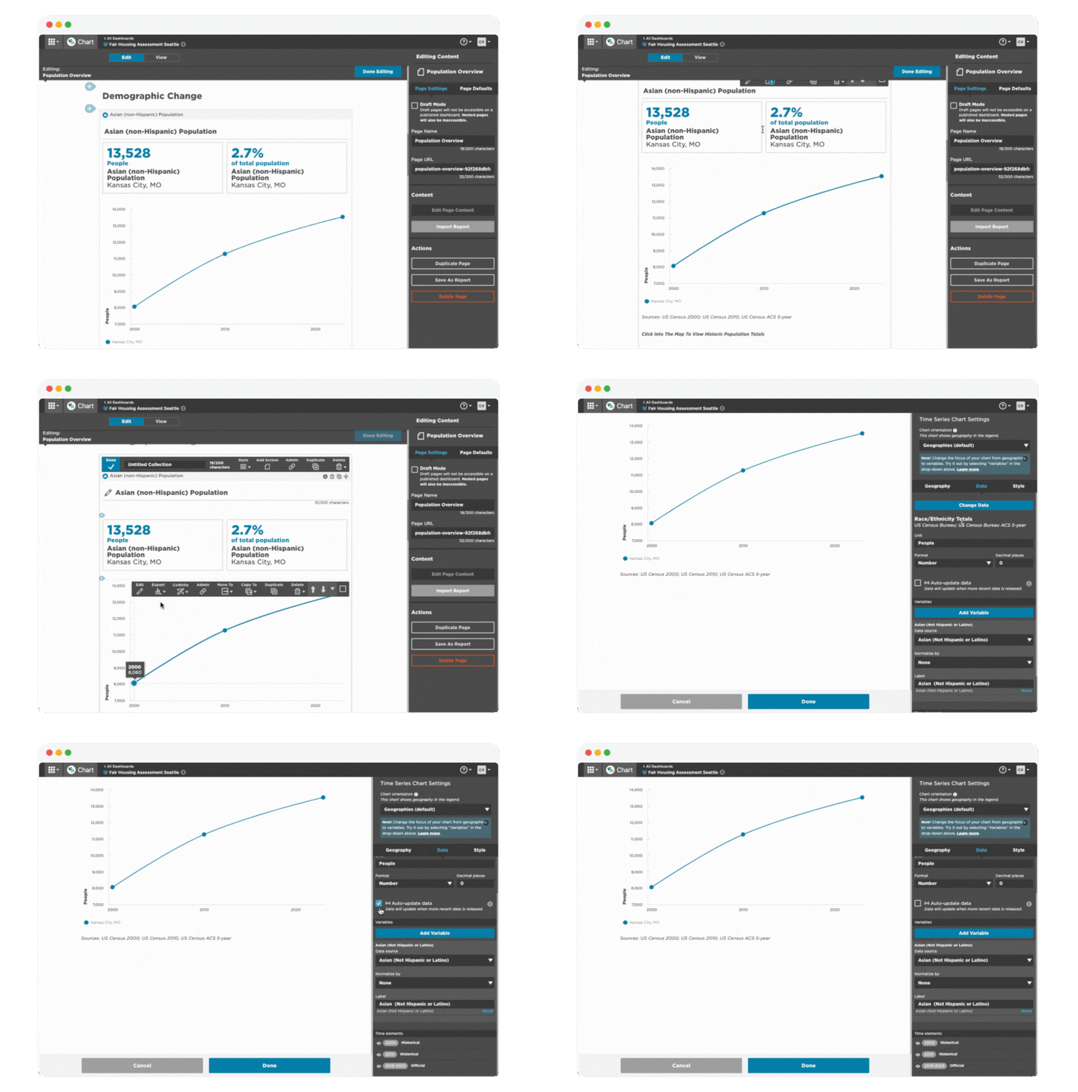
See how things change over time
Instead of looking at a snapshot of data at a single point in time, mySidewalk makes it easy for you to conduct longitudinal analysis with time series charts that track data over time.

Engage anyone with dynamic visualizations & narratives
mySidewalk's maps and charts are interactive, helping your audience see multiple data points, zoom in, and hover over every Tools like CoWrite make it easy to describe visualizations and
