

What did City Leaders need most? That was our question in early 2019. The mySidewalk team interviewed dozens of city departments around the U.S. to answer it. Our goal was to understand what the perfect city performance management solution looked like.
Leaders told us they needed a better way to measure and communicate KPI progress. They required more transparent internal and external communication. City Councils wanted to understand what initiatives were working, and see data on their impact.
mySidewalk’s goal was to solve those challenges. To create a tool that would help cities maintain their strategic plans and efficiently track performance. Cities across America are now using our solution.
The 8-minute video below gives a quick demo of this best in class city performance dashboard. See how you can use it to track progress, using the performance summary, interactive maps, data library, and department reports.
A Better City Performance Dashboard
We created a templated city performance solution based on best practices from our team of seasoned subject matter experts and analysts. This framework allows our partners to quickly and easily add their information and initiative details.
Performance Summary
First and foremost, we knew our solution had to provide an engaging at-a-glance summary, showing how a city was tracking against their key objectives.
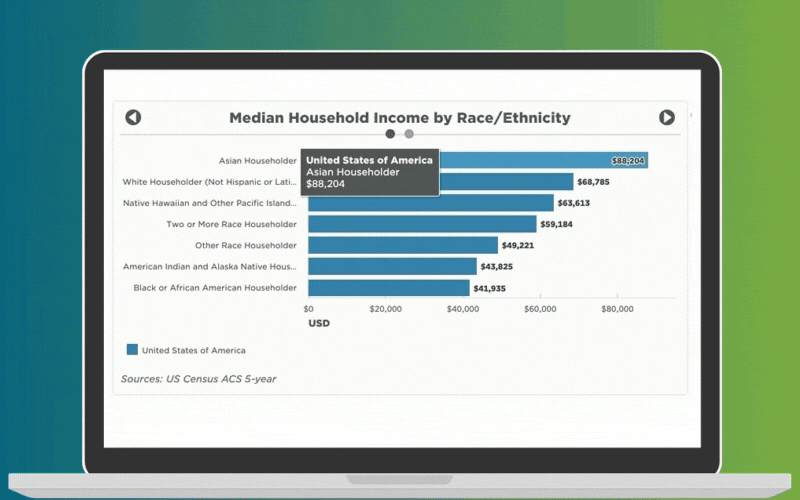
That’s why the first thing you see is a checklist of those priority indicators. If you click one, you get a great visual – a chart, graph, etc. displaying that particular KPI. The maps are especially helpful as they illustrate how the indicator data applies across your city.
Data Library
Many of our partners don’t have specific KPIs, metrics, or indicators when they come to us. That’s why we provide the mySidewalk Data Library. It has thousands of indicators you can choose from, all of which are automatically updated. So even if you don’t have customized data sets, you can still track your progress right out of the gate.
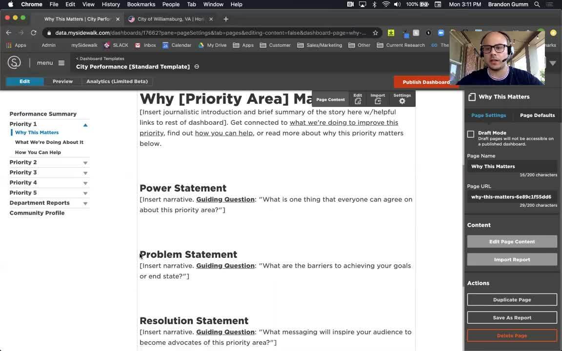
Guided Messaging
Also included in the template are messaging outlines. Think of them as prompts. They're designed to help you tell a compelling story about each priority area.
For example, what’s one thing everyone can agree on about your top priority? The answer is your Power Statement. For economic development, your Power Statement might be, “We all deserve to make ends meet.” Or, “Everyone deserves a quality job.”
Your Problem Statement explains the barriers to achieving your goals like, “Everyone deserves a quality job, but not everyone has what they need to get it.” We use simple, poignant language to frame priorities, like “why this matters” and “what we’re doing about it.” Customers frequently use these dashboard sections to guide their City Council discussions.
We help your team create each of these sections, and refine your story, so it's as powerful as possible.
Department Reports
Another critical challenge city leaders told us about was internal transparency. Not being able to effectively track the actions of individual departments. So as part of this template, we created Department Reports. It’s a section where each team can showcase their unique KPIs, highlight progress, and celebrate their accomplishments.
We know managing data can be overwhelming. Our goal is to empower you as a changemaker. To help you democratize your data, so that it's available to all, and inspires action. If you're interested in a dashboard like this, we can help you build one in as little as three months.
Learn more about mySidewalk Performance dashboards, request a demo, or see how the City of Williamsburg Virginia, uses mySidewalk to track success.
Share this
5 Eye-opening Data Lessons after a Year of Sheltering at Home

City Performance: How to Get Your City Ready for Data Transformation

No Comments Yet
Let us know what you think