

I’ve spent the last 15 minutes or so debating in my head whether the term is HOMING pigeon or HONING pigeon. On one hand, homing makes sense because you are letting the pigeon go only to come home again on his own. On the other hand, honing makes sense because the pigeon is honing in on his task with the tenacity and resolve that pigeons are known for.
After this riveting internal conversation, I started to second guess whether the analogy I wanted to make in this article was even appropriate. Maybe I was actually thinking of falconry, where someone wears a very heavy glove and the bird attacks and retreats on the command of her master.

The origin of this time I spent that I can never get back is an analogy for life at mySidewalk. The promise of data is progress, but the reality is messier. We exist to simplify the process for our clients as they leverage data for action. In my last article I discussed our approach to curating the right indicators for your unique story.
Taking a big step back, we’ve been thinking a lot about how we even get the data we need for the story--in our health solution we hear often how difficult it can be to get relevant indicators in a timely way. Health challenges change more rapidly than most datasets can keep up.
So like a carrier pigeon (I googled it! They become carrier pigeons when they carry messages), we try and go get the data our clients need and bring it back as long as it’s publicly available and doesn’t require top secret national security clearance. We bring it back to be processed, analyzed and made beautiful. This often means our team of pigeons has to fly to the State Health Department, the keeper of the needed data for many of our Local Health Department partners.
After a few round trips, we started to analyze the variation in time to delivery of our Community Health Assessment (CHA) data stories as well as a qualitative analysis of overall stress and tension levels conducted over various sessions at the jazz club next door. We came to understand that the terrain we navigated on our data acquisition flight has a big impact on our success.
In some places, we glide on a warm tropical breeze that smells like jasmine. At the end of our trip, a warm ocean full of all the data you can imagine: outcomes by race, gender and age available at a relevant granularity and exportable in a CSV or other such useful file. We come back with that little vial thing around our neck and immediately process and layer the data into the CHA with time left over to devote to some self-care for our tired wings.
In other places, the air is frigid. It freezes the tears in your eyes so you have to keep blinking or else you’ll go blind.
The data — if there is any — is guarded by a very angry dragon who requires you to surrender your first-born pigeon child to the GoH (God of HIPAA), burn off your fingerprints and fill out a form on Microsoft Access and then fill it out again on paper with a pen that you have to hold in your chattering beak. After 40 days and 40 nights, the data is released to you in a pdf.
Ever tried to analyze data in a PDF?
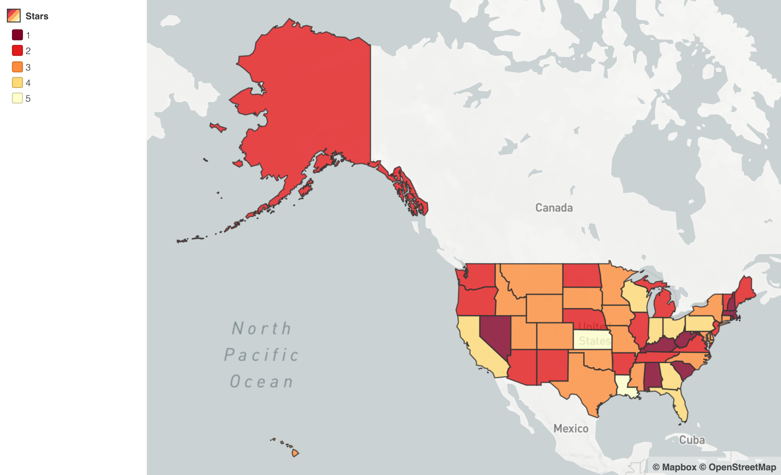
So we set out to find a comprehensive assessment of state health data portals that could help us guide our workflow — where were the states with strong systems? What did this mean for the lives of the local departments that they serve? To our surprise, we could not find any analysis of the relative strengths and weaknesses of state data portals.
If there’s one thing to know about me, I love power rankings. I love all rankings, awards, podiums, medals, and scoring systems. I love anything with the ability to come out on top. I’m very little fun at board game night… I’m not there for the journey, I’m there for victory.
On the heels of getting a fresh new crop of bright and brilliant interns, we decided to DIY this thing and created the first ever mySidewalk State Health Data Portal Power Rankings.
We are still looking for a name that rolls off the tongue easier.
We developed a star system based on a set of criteria including export functionality, granularity, timeliness, comprehensiveness of indicators, customization and user experience of the site itself. We also analyzed potential predictors of the variation like population of the state, state level average life expectancy, accreditation status, governance structure and number of FTE’s.
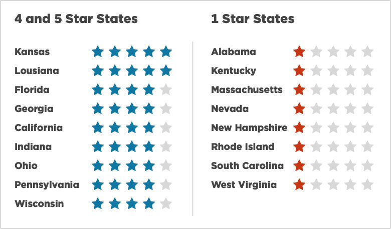
I was disappointed to find out that life expectancy was not predicted by the strength of the state data portal because I had already planned out my Nobel Prize acceptance speech. We did find that the number of FTE’s increased the power ranking, as did the likelihood that the department was accredited.
We plan on testing more of these predictors down the road and welcome any ideas you might have about what can explain variation above and beyond the usual suspects.
As much as I love competition, when data flows freely we all win. Whether your state is ranked high or low here, let’s take it to the next level together. We can spend all the time we save searching for data on pursuing new hobbies (like Falconry!).
-Dr. Sarah Martin, Director of Health Solutions
Share this

CHR&R in Flux: Our Commitment to Public Health Data

Ding. Sidekick leveled up.

Comments (2)