

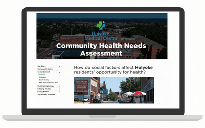
We asked our partner, the Holyoke Medical Center, to describe their experience working with mySidewalk. Here is their story in the words of their Director of Community Benefits, Kathleen Anderson. See the Holyoke CHNA Dashboard.

 The data captured in the mySidewalk platform helps Holyoke Medical Center drill down on health needs by neighborhood and allows the hospital the opportunity to understand and provide needed support services or other types of interventions. This valuable information is used by Holyoke Medical Center, as well as their affiliate organizations to apply for grants and for reporting purposes.
Holyoke Medical Center shares the Community Health Needs Assessment dashboard on their website. The dashboard has become an easy go-to source for understanding the social determinants of health in their community. It's now public, allowing the Holyoke team and the greater Massachusetts community to access more up-to-date needs, understand factors by region, and more.
"Our CHNA dashboard gives us data, maps, and visuals that paint a powerful picture of our community's needs. It has taken our CHNA to the next level and helps us to plan our outreach and support within the community. I would tell someone on the fence about mySidewalk to definitely give them a try. It will open their eyes and give them a better picture of what’s going on in their community."
- Kathleen Anderson, Director of Community Benefits at Holyoke Medical Center
Your CHNA can do more. mySidewalk can help.

mySidewalk helps health systems and Public Health departments transform their Community Health Needs Assessments. We partner with you to create custom, dynamic CHNA dashboards that help you: get 10x the stakeholder engagement, improve data accuracy, cut costs, and save time. Learn more.
Share this
.png)
Putting the "Community' Back into the CHNA
A Complete Picture of Health: Introducing the80

No Comments Yet
Let us know what you think